Deep Eutectic Solvents as Non-flammable Electrolytes for Durable Sodium-ion Batteries

Authors: Dries De Sloovere, Danny E. P. Vanpoucke, Andreas Paulus, Bjorn Joos, Lavinia Calvi, Thomas Vranken, Gunter Reekmans, Peter Adriaensens, Nicolas Eshraghi, Abdelfattah Mahmoud, Frédéric Boschini, Mohammadhosein Safari, Marlies K. Van Bael, An Hardy
Journal: Advanced Energy and Sustainability Research 3(3), 2100159 (2022)
doi: 10.1002/aesr.202100159
IF(2022): ??
export: bibtex
pdf: <AdvEnSusRes> (OA)


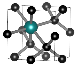
Graphical Abstract: Understanding the electronic structure of Na-TFSI interacting with NMA.

Abstract

Sodium-ion batteries are alternatives for lithium-ion batteries in applications where cost-effectiveness is of primary concern, such as stationary energy storage. The stability of sodium-ion batteries is limited by the current generation of electrolytes, particularly at higher temperatures. Therefore, the search for an electrolyte which is stable at these temperatures is of utmost importance. Here, we introduce such an electrolyte using non-flammable deep eutectic solvents, consisting of sodium bis(trifluoromethane)sulfonimide (NaTFSI) dissolved in N-methyl acetamide (NMA). Increasing the NaTFSI concentration replaces NMA-NMA hydrogen bonds with strong ionic interactions between NMA, Na+, and TFSI. These interactions lower NMA’s HOMO energy level compared to that of TFSI, leading to an increased anodic stability (up to ~4.65 V vs Na+/Na). (Na3V2(PO4)2F3/CNT)/(Na2+xTi4O9/C) full cells show 74.8% capacity retention after 1000 cycles at 1 C and 55 °C, and 97.0% capacity retention after 250 cycles at 0.2 C and 55 °C. This is considerably higher than for (Na3V2(PO4)2F3/CNT)/(Na2+xTi4O9/C) full cells containing a conventional electrolyte. According to the electrochemical impedance analysis, the improved electrochemical stability is linked to the formation of more robust surface films at the electrode/electrolyte interface. The improved durability and safety highlight that deep eutectic solvents can be viable electrolyte alternatives for sodium-ion batteries.

Assigning probabilities to non-Lipschitz mechanical systems

Authors:  Danny E. P. Vanpoucke and Sylvia Wenmackers
Journal: Chaos 31, 123131 (2021)
doi: 10.1063/5.0063388
IF(2021): 3.642
export: bibtex
pdf: <Chaos>   (Open Access) <ArXiv v1>
github: <NortonDomeExplorer>


Malament's Mounds
Graphical Abstract: Examples of Malament’s Mounds, of which the Norton Dome is the special case where α=½.

Abstract

We present a method for assigning probabilities to the solutions of initial value problems that have a Lipschitz singularity. To illustrate the method, we focus on the following toy-example: \ddot{r} = r^{a}, r(t = 0) = 0, and \dot{r}|_{r(t=0)}= 0, with a∈]0; 1[. This example has a physical interpretation as a mass in a uniform gravitational field on a dome of particular shape; the case with a = ½ is known as Norton’s dome. Our approach is based on (1) finite difference equations, which are deterministic; (2) elementary techniques from alpha-theory, a simplified framework for non-standard analysis that allows us to study infinitesimal perturbations; and (3) a uniform prior on the canonical phase space.  Our deterministic, hyperfinite grid model allows us to assign probabilities to the solutions of the This allows us to assign probabilities to the solutions of the initial value problem in the original, indeterministic model.

Phase space vector field for all Malament's mounds

Phase space vector field for all Malament’s mounds

TEDx Talk: The Virtual Lab

Happy to announce my TEDxUHasselt talk is officially part of the TEDx universe:  https://www.ted.com/talks/danny_vanpoucke_the_virtual_lab .

I enjoyed talking about the VirtualLab. Showed examples from atoms to galaxies, from computer-chips to drug-design and from to opinion-dynamics to epidemiology. I looked at the past and and glanced towards the future, where machine learning and artificial intelligence are the new kids on the block.


Creating online forms and catching spam-bots

Recently, I decided to add a custom registration form  to my website, as part of an effort to improve and streamline the “HIVE-STM tool experience” 😉 . Up until now, potential users had to directly send me an e-mail, telling me a bit more about themselves and their work. I would then e-mail them the program, and add their information to a user list for future reference (i.e., support and some statistics for my personal entertainment).

This has the drawback that any future user needs to wait until I find the time to reply. To improve on the user-friendliness, I thought it would be nice to automate this a bit. A first step in this process entails making the application a bit more uniform: using an online registration form.

The art of learning something new: Do it from scratch

What started out with the intention of being an almost trivial exercise in building a web-form, turned into a steep learning curve about web-development and cyber-security. I am aware there exists many tools which generate forms for websites or even provide you a platform which hosts the form (e.g., google-forms, which I used in the past), but I wanted to do implement it myself (…something to do with pride 😉 ). Having build websites using HTML and CSS in the past, and having some basic experience with Javascript, this looked like a fun afternoon project. The HTML for the form was easily created using the tutorials found on w3schools.com and an old second edition “Handboek HTML5 en CSS3“, I picked up a few years ago browsing a second hand bookshop. Trouble, however, started rearing its ugly head as soon as I wanted to integrate this form in this WordPress website. Just pasting this into a page or post doesn’t really work, as WordPress wants to “help” you, and prevent you from hurting yourself. This is a fantastic feature if you have no clue about HTML/CSS/… or don’t want to care about it. Unfortunately, if you want to do something slightly more  advanced you are in for a hell of a ride, as you find out the relevant bits get redacted or disabled.

Searching for specific solutions with regard to creating a custom form in WordPress I was astounded at how often the default suggestion is: “use plugin XXX” or “use tool YYY”. Are we loosing the ability to want to craft something ourselves? Yes of course, there are professional tools available which can be better than anything you yourself can build in a short amount of time…but should it discourage you of trying, and feeling the satisfaction of having created something? I digress.

In the end, I discovered a good quality tutorial (once you get past the reasons why not to do it) and I started a long uphill battle trying to bend WordPress to my will:

  1. Paste form-code in postWP countermove: remove relevant tags essentially killing the form.
  2. Solution: put the form in a dedicated template ⇒ WP countermove: hard to integrate in existing theme, will be removed upon update of the theme
  3. Solution: create a child-theme ⇒ WP countermove: interesting exercise is getting the CSS style-sheet to work together with that of the parent theme. (wp_enqueue_style, wp_enqueue_scripts, get_template_directory_uri() and get_stylesheet_directory_uri() saved the day.)
  4. Add PHP back-end to the form…and deal with the idiosyncrasies of this scripting language. Crashed the website a few time due to missing “;”… error messages would be nice, instead of the blank web-page.


Trying not to torture future users

At this point, the form accepted input, and collected it via the PHP $_POST global variable. En route to this point, I read quite a few warnings about Cross-Site Request Forgery (CSRF) and that one should protect against it. Luckily, the tutorial practically showed how to do this in WordPress using nonces…in contrast to WordPress theme handbook which gives in formation, but not easy to understand if you are new to the subject.

With a basic sense of security, I was aiming at making things user-friendly, i.e., if something goes wrong it would be nice if you do not need to again fill out the form entirely. Searching for ways to keep this information I came across a lot of options, none of which seemed to work (cookies, PHP variables, global variables, etc). The problem appeared to originate from the fact that the information was not persistent. Once the web page started reloading, everything got erased. It was only at this point that I learned about “transients” in WordPress, and using get_transient() and set_transient() resolved all the issues instantaneously. There is only one caveat at this point: If two potential users submit their registration at almost the same time one may end up seeing the registration information of the other. (However, at this time the program is far from famous enough to present any issues, so statistics will save us from this).

Only one thing remained to be done: put all relevant information into two e-mail messages, one to be sent to myself, and one to be sent to the potential user. For this, I made use of the PHP mail() function. It works quite nicely, and after playing around with it for a bit (and convincing myself a nice HTML formatted layout will not work for example in gmail) the setup was complete. That evening, I went to bed, happy with the accomplishment: I had created something.

Too popular for comfort

Bot Activity on the HIVE registration form during February and March of 2021.

Bot Activity on the HIVE registration form during February and March of 2021.

The next morning, I was amazed to find already several applications for the HIVE-STM program in my mailbox (that is, in addition to my own test runs). These were not sent by real humans, but appeared to be the work of bots just filling out the form and sending it off. This left me a bit puzzled, and I have been looking for the reason why anyone would actually bother writing a bot for this purpose. So far I’ve seen the suggestion that this is to improve the SEO of websites, generate spam-email (to yourself or with you as middleman), DOS-attacks, get access to your SQL database via code injection,…and after all my searches, I start to get the impression this may also be a means of promoting all the plugins, tools, frameworks that block these bots? In roughly each discussion you find, there will be at least one person promoting such a foolproof perfect tool 😯 🙄 …but might just be me.

So how do we deal with these bots, preferably without driving potential users crazy? Reading all the suggestions (which unfortunately provide extremely little information on the actual working and logic of spam-bots themselves) I added, in several rounds, some tricks to block/catch the bots, and have been tracking the submits since the form went live. As you can see there is a steady stream of some 50 bots weekly trying to fill out the form. The higher number in the first week is due to any submission being redirected to the original form page, as such the same bots performed multiple attempts within the time-range of a few minutes. In about two months, I collected the results of 400 registration attempts by bots (and 4 by humans).

Analyzing the results, I learned learned some interesting things.

How to catch a bot? I track 4 different signals which may be indicative of bot behavior.

How to catch a bot? I track 4 different signals which may be indicative of bot behavior.

1. To Captcha or not to Captcha?

One of the first things to add, from a human perspective is “a captcha”. The captcha is manually implemented simple random sum/product/subtraction. It should be easy for humans, but it is annoying as they need to fill out an extra field (and may fill it out incorrectly). Interestingly, 56% of the bots fill out the Captcha correctly. Of course more complicated versions could be implemented or used…but the bottom line is simple: it generally does not do the job, and annoys the actual human being.

2. Bot Trapping for furs?

Going beyond captcha’s, a lot of tutorials suggest the use of a honeypot. One can either make use of automated options of existing frameworks, plugins or …implement these oneself. This option appears to be very successful in targeting bots. The 1% successful cases coincided with the only human submissions. At this point we appear to have a “fool-proof” method for distinguishing between humans and bots.

3. Dropping the bot down the box?

Interestingly, drop-down menu’s with not generally used topics seem to throw off bots as well. The seniority drop-down menu shows failure rates even better than the captcha.

Conclusion

Writing your own form from scratch is a very interesting exercise, and well worth the time if you want to learn more about web-security as well as the inner workings of the framework used for your website. Bots are an interesting nuisance, and captcha’s just bother your user as most bots can easily deal with them. Logging the inputs of the bots does show a wide range in quality of these bots. Some just fill out garbage, while others appear to be quite smart, filling out reasonable answers. Other bots clearly have malignant purposes, which becomes clear from the code they try to plug into the form fields.

For now, the registration form seems to be able to distinguish between human-and bot-users. As such, we have successfully completed another step in upgrading the STM-program

TEDxUHasselt: Virtual Lab

Saturday March 20th at 19h00, I have the pleasure of speaking at the TEDxUHasselt 2021 event.

We will visit the virtual lab and I’ll dive into the important questions about computational researchers: Who are we?  Why do we like supercomputers…and rubber ducks? And what does the future hold?

Along the way, I’ll touch on the use of computational research for any subject imaginable: from atoms to galaxies, to the spread of diseases as well as opinions.

Update 22/03/2021:
The entire live-stream is still online available at here. (My presentation starts at ~7’30 😉 ).


A new life for the HIVE-STM program

“Once upon a time, there was a young researcher studying the formation of Pt nanowires on Ge substrates using quantum mechanical simulations. The results of the experimental counterparts were excellent; they provided Scanning Tunneling Microscopy images of ridiculously high quality …but not really atomistic structural information or detailed electronic band structures. On the other hand, the calculation-software of the young researcher provided only ground state energies and electronic band structures…but no Scanning Tunneling Microscopy images. So the young researcher set out to resolve this discrepancy.”

About 15 years ago, when starting out as a fresh Ph.D. student, I faced this mismatch between what my calculations could do and what my experimental counterparts had on offer. High quality ground state energies are nice, but rather useless in an experimental context governed by meta-stable states and high temperature transitions (especially since DFT represents only 0K results). I had to find a way to connect my calculations directly to the available experimental data, which boiled down to simulating Scanning Tunneling Microscopy (STM) images.

Original Delphi program: Graphene

Original Delphi program: Graphene

At that time, my programming skills were still nascent, but I felt king of the world knowing both pascal/Delphi and C/C++. I had written toy-programs in both languages, going from a text based battleships in turbo-pascal over a brick-buster game in C/C++using the djgpp compiler and allegro library to create the GUI, and many GUI programs in Delphi (e.g., the programs needed to numerically calculated Bose-Eistein condensation behavior for molecular condensates during my masters thesis). Based on those experiences, I knew that writing a GUI program  was much more straight forward in Delphi. So I set out writing my STM program using Delphi in the year(s) 2005-2006**. On the right you can see an screenshot of this program, generated today 15 years later, on the electron density of graphene. The program written in windows XP, ran smoothly and without modification or required recompile on both windows 7 and the current windows 10. Not to bad, if I say so myself. Try that with a python “program” 😈 .[1]

Free-standing Pt-induced nanowire on Ge(001).

Simulated STM image of the Pt-induced nanowires on the Ge(001) surface. Green discs indicate the atomic positions of the bulk-Ge atoms; red: Pt atoms embedded in the top surface layers; yellow: Ge atoms forming the nanowire observed by STM.

The program was designed to work for my specific use-case at the time: a germanium 001 surface, with a nice rectangular surface unit cell (see figure on the left). This has the unfortunate consequence that systems with a non-rectangular unit cell appear skewed, as is seen for the graphene example above. However, as I never needed such systems myself, no fix was ever included.

After presenting STM results in my first published paper in 2008,[2] I got some questions if it was possible to share the program. I shared the program on an as-is basis: free to use, and I hope it works for you as well, but no support.

Reading the above you may wonder: “Why didn’t you put the source on GitHub, such that other people could collaborate with you on it, and extend it and fix bugs?” The answer is rather simple (and sobering at the same time): GitHub didn’t exist yet when I wrote the program, as it was founded only in February 2008. It grew rapidly since then (surpassing SourceForge in mid 2011), but as I was working on other projects there was no time to support such a setup.

The number of people asking for the program grew steadily, and there was the nagging feeling at the back of my head that I should really clean up the code and make it cross-platform. In 2011, I had a short period when I decided to start from scratch and write the program anew in Java. Unfortunately, my available time ran out, and initial tests showed the program had a hard time reading the large charge-density files fast. So the original Delphi version remained in use being distributed to new users. By September 2012, this program developed for my own purposes had been requested by 100 researchers (which is a lot considering the boundary conditions: (1) needing atomic scale STM simulations  and (2) using VASP for DFT calculations), and over 200 researchers had requested it by 2015. Currently, in January 2021, the counter indicates over 400 requests. Still the same piece of software, being used by people I never imagined would be interested on OS’s it was never designed for. Despite its simplicity, this unexpected interest makes me extremely proud. 😎 

Distribution of users over the continents and evolution of requests over the years.

Distribution of users over the continents and evolution of requests over the years.

Thorny roses: Some issues popping up

Given the original intent of the program and its eventual use, one should not be amazed that some issues popped up over the years. However, no serious bugs were encountered (which still amazes me).

  • Non-orthogonal surface units: This is the oldest known limitation of the program. It assumes a rectangular surface unit as it uses the direct grid used in the VASP CHGCAR file as a pixel grid. This suited my own purposes well, but is unfortunate for the user studying hexagonal surfaces.
  • “Smart” Antivirus software (1): In the early days, I just sent a zipfile with the program and manual to new users. Unfortunately, AVs do not like people mailing executables, leading to mails being blocked. For some time the problem could be circumvented by zipping the zipfile and later even renaming the extension of the second zip round to prevent the AV of trying to look inside. I know, one should not do this and applaud the AVs for protecting their users, as people did spread trojan horses and other viruses like this back in the days. (Who clicks on those strange attachments anyhow?) So we ended up storing the program and zip online with password protection. We are not yet safe of AVs as some still complain about the risks of downloading things of the internet…but at least we are not (yet) back at the automatic shredding of the program.
  • “Smart” Antivirus software (2):  Did I say the program was written in Delphi? Apparently so were a lot of computer viruses and worms. (Must be a sign of being a nice and easy to use language 🙂 ) With smart AVs training on pieces of code from such fraudulent software it becomes rather hard to write any code using Delphi which has not been part of a virus…and thus your program gets flagged. Some AVs are nice enough to tell the user, and even provide an option to keep the program. Others just shred it without even mentioning it (not cool). This is unfortunately becoming more of a problem. Online multi-virus-scanners give a rather bleak picture, as can be seen below.

    smart AVs giving false positives on the old HIVE executable.

    smart AVs giving false positives on the old HIVE executable.

  • Windows 10: Extending on the previous, windows 10’s anti-virus protection follows suit throwing up warnings and messages of possible security threats.
  • Mac and 64bit: Although the program was written for windows, it also runs smoothly in unix environments when using an emulator such as Wine, making the program available to Linux and Mac users as well. Unfortunately since the Mac OS version Catalina, Mac has dropped support for 32bit executables, making it no longer possible to run the 15 year old executable. [1] Remember that in 2006 64bit programs were new and not generally supported. Furthermore, 32bit executables tend to work smoothly on a 64bit system, they just “waste” half the memory.


The Future of HIVE-STM

Over the years, I’ve often considered it time to clean up the code, and upgrading it. Unfortunately time was always a major issue. In addition, I no longer had a working Delphi compiler so I was lured to the idea of rewriting it in a different programming language (I seriously considered reworking it in fortran, though the easy access to a GUI stopped me from doing this).

The latest issue with Macs and the zealous persecution of Delphi programs by AVs finally got me to the point of starting a full rework of the HIVE-STM program as a hobby project. The maturity of the Lazarus IDE and free-pascal compiler is an important second component. During the summer holidays of 2020, I started porting the original Delphi code to the Lazarus IDE and free-pascal. This successful port gave me the courage to continue working on it, and I am currently performing a full rewrite of the internals (so far things have gone smoothly). The new version will become available via GitHub once I am confident it is working well and a have setup a good method of keeping track of new users.

New years resolution 2021:
“Finally build a new ‘updated’ version of HIVE-STM “


References

[1]Challenge to scientists: does your ten-year-old code still run?“, J.M. Perkel, nature technology feature, august 24th 2020.
[2]Formation of Pt-induced Ge atomic nanowires on Pt/Ge(001)“, D.E.P. Vanpoucke & G. Brocks, Phys. Rev. B 77, 241308(R) 2008.

Review of 2020

Happy New Year

2020 will forever be the year of viruses for me and a lot of us. At Maastricht University, the year started with a university wide cyber-attack with ransomware. After the computer-viruses came the human viruses, with COVID-19 shutting down one country after the other, and shutting down education systems as well.

Hopefully 2021 will be better behaved, though we know already some of the hurdles which will make life interesting the coming year. COVID-19 is far from over, and it will take at least a year to vaccinate everyone. Furthermore, as of the first of today, the United Kingdom is no longer a part of the EU, making travel inside Europe a little harder again.

But before we launch into these new and interesting times, lets look back at 2020 one last time, keeping up with  tradition. What have I done during the last year of academic merit.

1. Publications: +6 (and currently a handful in progress)

2. Completed refereeing tasks: +17

  • Applied Physics Letters
  • Journal of Physical Chemistry (2x)
  • Computational Materials Science (2x)
  • Materials Chemistry and Physics
  • Journal of Physics: Condensed Matter (5x)
  • Diamond and Related Materials (6x)

3. Conferences & workshops in times of Corona: +3/+1 (Attended & Organised), >+4 internal 

ACOS poster prize 2020

ACOS poster prize 2020

With regard to conferences, 2020 was the year everyone came into contact with the concept of the online conference. Many conferences and events got canceled: such as TEDx@UHasselt (which will return in 2021)

  • ACOS 2020, Online, Oktober 28th, 2020 [poster presentation and video-pitch, 2nd poster prize]
  • RSC Chemical Science Symposium 2020, Online, September 29th-30th, 2020 [iposter presentation]
  • D-NL-HIT project meetings [oral presentations]
    • Virtual Partner Meeting, April 8th, 2020
    • Adhesives Pilot Branch meeting, October 7th, 2020
    • Virtual Partner Meeting, October 15th, 2020
    • UV-Curing Branch meeting, October 22nd, 2020
  • SBDD XXV, Hasselt University, Belgium, March 11th-13th, 2020 [(invited) oral presentation, poster presentation] …On Friday13th Belgium went into it’s first lock-down.
  • Pilot Branch meeting adhesives D-NL-HIT project, Maastricht University, Brighlands campus, February 26th, 2020 [Organised]

4. Science Communication & Social media:   

  • In February 2020, I finally caved and joined Twitter as @DelocalizedD .
  • Added several new repositories to my github account, with the most important ones being:
  • Started a YouTube channel (for the ACOS video pitch)

5. Current size of HIVE:

  • Continued work on a public version of HIVE at github: HIVE 4.x   (26K lines, 9 commands available)
  • 61K lines of program (code: 69 %)
  • ~100 files
  • 49 (command line) options

6. Hive-STM program:

And now, upward and onward, a new year, a fresh start.

Gnuplot animated gifs: Visualizing Machine-Learning models

One of the most important aspects in machine-learning—in addition to the modeling itself—is undoubtedly visualization. This can be of either the data set itself or the resulting model. When dealing with small or sparse data sets and a limited number of features, visualization can be extremely helpful to get a feel for your model and data. In this tutorial, we show how you can use gnuplot to generate interesting animations of your data, such as the example above.

What do you need?

  • Install Gnuplot  version 5.2.8 (or higher) for your OS (under windows you can also install it under your Cygwin installation)
  • A data set as a simple multi-column text-file data.dat .
  • A similar text-file, model.dat, with your model calculated on a grid .

1. Starting simple: a static image

The main difference between an animation and a static image is the fact the former is just a series of such static images shown one after the other.

1.a. Basic image

Gnuplot allows both interactive and scripted command-line usage. The commands used in interactive mode can simply be placed in a text-file (e.g., myplot.gpl) and run using  the command:

> gnuplot myplot.gpl

Comments can be added in such a file by preceding them with a single “#“. In the examples below, I’m using “###” as a personal choice. It shows clearly the location of the comments, and also gives me an easy way to distinguish with script lines I commented out for testing purposes, in which case I use a single #. In the following I also indicate gnuplot commands in red, while options are indicated in turquise. Let u start by plotting the data set in a simple png:

### Set the output to a png file
set termopt enhanced
set terminal pngcairo size 300,300 font "Helvetica-Bold,6"
### The file to write to
set output 'modelplot_v1.png'
### The Title label
set title 'ML model tutor' font "Helvetica-Bold,10"

splot "data.dat" u 1:2:3
Model v1

Model v1

With this we set the output to be a png image of 300×300 pixels. (Note: pngcairo also provides png-functionality using the cairo-library. For more complex plotting, it gives much nicer images.) The default font for text is set to “Helvetical-Bold” with a font-size of 6pt. The enhanced option further allows us to use LaTeX type strings, for example indicating subscripts as A_n to print An. The resulting image is stored as ‘modelplot_v1.png‘.

The last two commands are used to create the actual plot. With set title a title can be added to the graph. The default font is replaced in this case by a slightly larger version of 10pt. The splot command  allows you to plot 3D surfaces using the same basic information as the gnuplot plot command for 2D plots. In this case, I used the first 3 columns of the data.dat file to plot 3D data, with the x:y:z giving the respective column numbers. The result is shown on the right.

NOTE: An important point to consider is the fact that the font size is absolute. So if you decide later-on to change your image size to say 500×500 pixels, your text labels may look rather small, and you will have to tweak the font-size to compensate of this behavior. Therefore, it is important to make sure you start with the right image size straight away. The 300×300 pixels used in this tutorial are too small for any scientific quality image, it was chosen to be a suitable image size to incorporate in this blog.

1.b. Pimp the axis

With the basics for the graph set up, we can start setting up the graph to our liking.

###settings for the boxplot
set xlabel "M_{n polyX} (g/mol)" offset 0,-1,0 font "Helvetica-Bold, 8" rotate parallel
set xrange[1000:10000] noreverse writeback
set xtics 2000,2000,10000 out scale 1.0 nomirror offset 0,-0.5,0

set ylabel "Graft (%)" offset 2,0,0 font "Helvetica-Bold, 8" rotate parallel
set yrange[0:30] noreverse writeback
set ytics 0,10,30 out scale 1.0 nomirror offset 0,-0.5,0

set zlabel "Particle size (nm)" offset 1,1,0 font "Helvetica-Bold, 8" rotate parallel
set zrange[0:300] noreverse writeback
set ztics 0,50,300 out scale 1.0 nomirror offset 0,-0.5,0

set xyplane at 0
set border lw 3


Model v2

Model v2

The label of each of the three axes can be modified individually using set {x/y/z}label followed by the same options available to any other string (such as the graph title earlier). Here you can see how the enhanced mode allows the use of a subscript using standard LaTeX formatting. The offset makes sure the axis-label does not overlap with the tick-labels. Gnuplot also allows you to define the range to be plotted using set {x/y/z}range[min:max], while set {x/y/z}tics gives you access to the specifics of the individual tics. The latter can be very useful to manually add specific tics, or, as in the current case, manually set the splitting between the different tics. The out option places the tic-marks at the outside of the graph, and their size is set by the scale option.

The command set xyplane can be used to set the intercept of the xy-plane and the z-axis, and set border gives access to the axis-line properties. Here I have set the line-width (lw) to 3.

1.c. Add the (machine-learning) model

Now that the basics properties of the 3D graph are alright*, let us add the model to the plot. This can easily be done by just adding additional input for the splot command.

splot \
     "data.dat" using 1:2:3 with points pointtype 7 pointsize 1 linecolor rgb "brown4" notitle, \
     "model.dat" u 1:2:3 w line lc rgb "sea-green" notitle
Model v3

Model v3

The “\” can be used to split the command to multiple lines. In this case, each curve/surface/data set is set on a separate line. Since the command for a single plot can become very long, gnuplot also has a shorthand for most common keywords/options it uses.  For the data the extended keywords are shown, and the shorthand is used for the model. The length of the command becomes significantly shorter, but at the same time harder to read. (Note that both shorthand as longhand keywords can be mixed in a single command.)

The data set is now being shown as points, using the 7th pointtype (which are discs). The size of these symbols is set to 1 and the linecolor is a predefined color used by gnuplot.  Finally, the notitle option removes the legend entry of this curve. The model data is presented as a line-surface. The end result is shown on the right.

1.d. A better surface-plot: Multi-plot
Model v4

Model v4

As you can see in the previous version of the plot, the model data is plotted as a surface, but this is not a very nice surface. This is because gnuplot just connected the sequential points in the file as a single very long and very complex curve. If you would rotate this plot, it would become clear, several things are very wrong. Luckily there is a very simple solution. Gnuplot has the ability to transform a point-cloud into a surface. This is done by setting a 3D grid using set dgrid3d X,Y. This creates a 3D surface for which the nodes are interpolated between the points of your point-cloud. When you set this option, it is applied on all data curves you plot (i.e., including the set of data-points, which we would like to avoid.). Using the multiplot option of gnuplot the two curves can be drawn separately, using different settings. In the script the splot command is replaced by:

### switch to a multiplot
set multiplot
set dgrid3d 50, 50 
splot \
     "model.dat" u 1:2:3 w line lc rgb "sea-green" notitle

unset dgrid3d
splot \
     "data.dat" using 1:2:3 with points pointtype 7 pointsize 1 linecolor rgb "brown4" notitle

unset multiplot

By setting the multiplot environment, we can unset dgrid3d before drawing the second data set. At the end of script we also unset multiplot to switch of the multiplot environment. At this point it become interesting to see the impact of the terminal pngcairo over png.

1.e. Surface coloring

Drawing a surface is nice, but you can also give it some color. Either by using the z-value as a color scale, or by using another metric/feature to color the surface.

###settings for the color scale
set colorbox vertical
set cblabel "Colormap\n (RGB)" font "Helvetica-Bold, 8" offset -6.75,8 rotate by 0
set pm3d at s explicit

splot \
      "model.dat" u 1:2:3 w pm3d notitle
Model v5

Model v5

Surface coloring is switched on via the command set pm3d which is set at the surface, and is used in splot at the with option. In addition to surface coloring also a color scale is added, with the label formatted using the same options as for other labels. To get the label above the color scale it needs to be shifted using the offset and the rotate option.

The result is rather fancy, but for practical purposes, the surface may actually block the view of the data points. This can be avoided by projecting the color on the xy-plane and retaining a grid representation of the surface. This is done by setting pm3d at the bottom.

Model v6

Model v6


In addition, we  also need to plot the model surface twice, once to generate the color map and once to generate the model surface as a grid-image.

set pm3d at b explicit

splot \
    "model.dat" u 1:2:3 w pm3d notitle,\
    "model.dat" u 1:2:3 w line lc rgb "sea-green" notitle


2. Creating an animation

With gnuplot it is quite easy to generate stunning 3D animated gif images. Some nice examples can be found all over the web, such as this animated Bessel function, my own (very old) molecular d-and f-orbitals, or this collection. Once you finish creating a script to generate a single image, creating an animation requires only some minor modifications. First of all we need to select the correct terminal (i.e., gif instead of png)

set terminal gif transparent animate nooptimize delay 10 size 300,300 font "Helvetica-Bold,10"
set output 'modelplot_v7.gif'

This generates a transparent animated gif with a delay of 10 ms between frames, and stores it in a gif image. In addition, a change in time/image frame needs to be implemented. This can easily be done by a simple for loop, which is wrapped around the plotting section.

n=60
do for [i=1:n]{
    set view 60, i*360/n

    ### do the multiplot plotting section 
    set multiplot 
    ...all the other plotting stuff of before
    unset multiplot
}
set output

model v7: animated

model v7: animated

In the example, the 3D graph is rotated. This is done by changing the view via the set view command which takes two angles in degrees. As you can see from “i*360/n“, gnuplot also accepts simple mathematical equations.

Once the loop is finished we need to close our gif animation. This is done via (a side-effect of) the command set output. The set output {filename} command sets the output to a file with name filename, or if a filename is omitted to the standard output. As a side-effect it closes the current output file, c.q. our animated gif.

An alternative method for creating an animation would be creating a series of images (in the image-format of your choice, e.g. pngcairo and then create an apng) and combining them yourself or via additional scripting into an animated image format using additional software, such as is done here.

3. Animated surfaces and coloring 

The example above is rather trivial in regard to animations. The ability to perform math inside a gnuplot script provides you the ability to make things a lot more interesting. In the following, we are going to construct a small imaginary solar system, to present some of the things which are possible.

The basic script for the solar system above can be downloaded here.

set termopt enhanced
set terminal gif animate nooptimize delay 10 size 300,300 font "Helvetica,10"
set output 'Solarplot_v1.gif'
set title 'Magic Solar System' font "Helvetica-Bold,10"

maxl=10
set xrange[-maxl:maxl] noreverse writeback
set yrange[-maxl:maxl] noreverse writeback
set zrange[-maxl:maxl] noreverse writeback
set xyplane at 0
set border lw 1.5

###Use parametric coordinated for plotting spheres
set parametric # enable parametric mode with angles (u,v)
set urange [0:2*pi]
set vrange [-pi/2.0:pi/2.0]
set isosample 360,180
fx(u,v)=cos(u)*cos(v)
fy(u,v)=sin(u)*cos(v)
fz(v)=sin(v)

### Surface coloring
set colorbox vertical
set cblabel "Planet\n colors" font "Helvetia, 8" offset -4.75,5 rotate by 0
set pm3d depthorder base nohidden3d
unset hidden3d

### The animated drawing
n = 60
do for [i=1:n]{
    # The star
    x=0.0
    y=0.0
    z=0.0
    r=3.0

    # The first planet
    x1=5.0*sin(i*2*pi/n)
    y1=5.0*cos(i*2*pi/n)
    z1=0.0
    r1=0.50
    color1(u,v)=0.5

    # The second planet
    x2=6.5*sin(i*2*pi/n)
    y2=7.0*cos(i*2*pi/n)
    z2=1.0*cos(i*2*pi/n)
    r2=1.0
    color2(u,v)=sin(v)*2*pi

    splot \
         "++" using (x+r*fx(u,v)):(y+r*fy(u,v)):(z+r*fz(v)):(6.5) w pm3d notitle,\
         "++" using (x1+r1*fx(u,v)):(y1+r1*fy(u,v)):(z1+r1*fz(v)):(color1(u,v)) w pm3d notitle,\
         "++" using (x2+r2*fx(u,v)):(y2+r2*fy(u,v)):(z2+r2*fz(v)):(color2(u,v)) w pm3d notitle 
}
set output

Most of the commands and options have already been covered above. To draw our spherical planets, we introduce a set of parametric coordinates (u,v) via the command set parametric. Next we set their ranges, just as you would do for the x,y, and z coordinates via set {u|v}range. The command set isosample is used to define the grid over the parametric space.  With this setup, you can now define any parametric surface you want. In our case, we want to have a sphere. For this we define three transformation functions. With u and v representing the θ and φ angles of a sphere, the transformation to Cartesian coordinates is given by the functions fx(u,v),fy(u,v), and fz(v).

In the main loop of the gif we define the center position (x,y,z) and the radius (r) of our planets and star, with the latter nicely fixed at the origin, and our planets having an orbit around it. To have a nice periodic gif, you should make sure that any periodic behavior ends up where it started, hence the 2pi factor in the sines and cosines.  Everything is drawn with a single splot command where we use a pseudo 4-column input style:

(x-coord):(y-coord):(z-coord):(color-coord)

Note that the brackets ‘(‘ & ‘)‘ are important to include as gnuplot will throw errors otherwise. The selected color, can be either a real value in the color scale or a function. The resulting solar system is shown below on the left.

Solar v1, no depth

Solar v1, depth

Not that bad for a first attempt. There is however a small snag: the 3D effect is somehow off when the planets move behind the star. This is due to the depth-buffering. The newest versions of gnuplot (≥5.2.8) provide the option depthorder for the set pm3d command. Using the value base for the depthorder option results in the depthorder to be decided based on the z-projected position of the object. This is sufficient to fix our little solar system, as you can see on the right.

3.a. Some cleanup work: removing the box and complex coloring 

As we are creating an imaginary (magical) solar system, we should maybe get rid of the x-,y-, and z-axis. This is done via the commands unset border to get rid of the axis-bars and unset {x|y|z}tics to remove the tic-marks and-labels.

unset border
unset xtics
unset ytics
unset ztics
set palette defined (0 "red", 1 "yellow",1 "brown", 2 "brown4",3 "dark-green", 4 "blue", 5 "white")
set cbrange[0:10]
#unset cbtics

Solar v2

And although the color palette provided is nice, if we want different color schemes on each of the planets, we quickly run into a small problem: you can only have 1 color palette per splot. In case of a static image, you might be able to get around this problem by using a multiplot (as before) and have overlapping splots with each their own palette. But…in that case you will also be responsible for getting the 3D order of your objects correct yourself. And although this may be doable for a single frame, in case of an animated 3D solar system this will be a hassle nearly impossible to overcome**. For this you need to tackle the problem in a different way: create your own color palette consisting of sub-palettes. This can be done via the command set palette defined. The pairs give the color at the endpoints of gradient ranges, with the overall range (here 0-5) representing the entire color scale. The intermediate points are placed equidistant, so for a color range from 0:10 the red-to-yellow gradient is linked to color values in the range 0:2, while the blue-to-white gradient is linked to the color values in the range 8:10. Applying this to our solar system we can give nice individual color palettes to each of the objects. I changed the size and position of the three objects a bit, and as you can see, the outer planet moves outside of the x/y/z-ranges. Now that we know how to add different color palettes to each of our planets, we can also remove the color-bar on the right using the command unset colorbox, remove the tics via unset cbtics, and remove the label via unset cblabel.

3.b. time-dependent colors 

We have motion of objects and different color palettes, what about changing the colors during the animation? As we saw earlier, the color component can be defined as a function, which means we can make this time-dependent as well. Let’s imagine that our outer planet is traveling on a rather elliptic orbit, making it heat up when it approaches our star.

# The first planet
    color1(u,v)=0.5*(cos(u)**5+sin(v)**3)+sin(i*6*pi/n) +8.0 
	
# The second planet
    x2=8+15*sin((i+20)*2*pi/n)
    y2=6.0*cos((i+20)*2*pi/n)
    z2=3.0*cos((i+20)*2*pi/n)
    color2(u,v)=0.99*sin((i+20)*2*pi/n+pi)+1

By making the color dependent on the frame number, the (uniform) coloring of our second planet will now cycle through the red-yellow gradient. The first planet experiences a variation at 3x the speed but have a non-uniform surface coloring.

Solar v3

3.c. time-dependent colors and shapes 

Once you have time dependent coloring, and time dependent motion, you can also have time dependent shapes and combine all three. This is all possible within the same basic framework set up above. For example, we can make our star a bit more active, letting it bulge and swirl. Adding another planet and some moons the magic solar system below is created by this gnuplot script.

Solar v4

4. Conclusion 

Gnuplot provides a versatile tool for creating animated gifs of your machine learning data and models, or anything else you could imagine. It has an extensive number of options which allow you to tweak each single property of your graph. The ability to perform simple arithmetic within a gnuplot-script further increases the potential.


* Ignore the rather crummy quality of the embedded images. This is an artifact of only having a 300×300 pixel image, the animation at the top of the page has an 1000×1000 pixel resolution and shows a much better quality.

** Of course with enough persistence you may find a way to  get it done…but there are less sadomasochistic ways of doing this 😉

COVID-19 in de groep?

België staat de laatste dagen zowat op zijn kop ten gevolge van de huidige corona-crisis. De cijfers schieten als een pijl de hoogte in, en geen van de tot nu toe genomen maatregelen lijken het tij te keren. Er wordt duchtig gediscussieerd over het L-woord (lock-down), en het lijkt onoverkomelijk. In plaats van een pleidooi voor of tegen te houden, laat ik je zelf beslissen. De situatie in België is immer zo ernstig dat zelfs primitieve benaderingen de situatie al redelijk goed benaderen. Voor nauwkeurige modellen ben je nog steeds aan het goede adres bij de epidemiologen. Deze modellen kun je gebruiken om strategieën te bedenken om dit virus in te dijken en de situatie op termijn te verbeteren. Dit zijn echter vaak vrij abstracte gegevens. Wat we als gewone burger willen weten is eigenlijk gewoon hoe veilig het voor ons is. Hoe groot is de kans dat we in een groep mensen – op het werk, op school, in de bus, of in de sportclub – één of meerdere personen hebben die met COVID-19 besmet zijn?

Als we aannemen dat besmettingen gelijkmatig verdeeld zijn over het land, leeftijdcategorieën en sociale groepen (dit is niet helemaal het geval, maar door het snel groeiende besmettingsaantal wordt dit een steeds betere benadering) dan kan je heel eenvoudig de kans op een aantal besmette personen “n” in een groep van “N” personen benaderen met de formule:

kans= \frac{N!}{n!(N-n)!} p^{n}q^{N-n}

waarbij p de kans is dat een willekeurig persoon besmet is, zijnde de besmettingsgraad. Voor een besmettingsgraad van 500/100 000 (waar alle provincies nu boven zitten) is p=0.005. q is de kans dat een willekeurig persoon niet besmet is (zijnde q=1-p). De term met de uitroeptekens (dat zijn “faculteiten”, en die stellen een reeks van vermenigvuldigingen voor, bijvoorbeeld: 4!=4x3x2x1) vertelt ons op hoeveel manieren (combinaties) er n personen besmet kunnen zijn in een groep van N personen.

Dit is allemaal leuk om weten, maar waar het om draait is natuurlijk wat dit voor jou betekent. Laat ons starten met de situatie van enkele weken geleden, toen er 500 besmettingen per 100 000 werden geconstateerd, dan ziet dat er voor groepen tot 50 personen als volgt uit:

De zwarte lijn toont hoe groot de kans is dat er geen enkele besmette persoon in de groep aanwezig is, terwijl de gekleurde lijnen de kans geven voor exact 1, 2, 3, 4 en 10 personen. Voor een schoolklas met 20-25 leerlingen valt dit nog mee, er is “maar” 10% kans dat er 1 of meerdere besmette leerlingen/leerkracht in de groep zitten. Merk op dat dit voor alle klassen van een school afzonderlijk geldt. Voor een kleine school met 6 jaarklassen (en maar 120-150 mensen) is de kans dat er niemand besmet is reeds gezakt tot ongeveer 50%.

Verdubbelen we de besmettingsgraad naar 1% (of 1 000 per 100 000) dan krijgen we dit beeld:

De kans op minstens één besmet persoon in onze denkbeeldige klas is gestegen tot 20%, terwijl de kans dat de kleine school besmettingsvrij is gebleven is ingezakt tot een magere 20%.

Gaan we naar de situatie zoals deze nu is dan hebben we te maken met een besmettingsgraad van ongeveer 3% (3 000 per 100 000). Het plaatje dat we dan krijgen is het volgende:

De kans op geen enkele besmetting in een klas van 20-25 leerlingen is gezakt naar 1 op 2! De kleine school, daar hoeven we ons geen illusies over te maken: de kans dat daar geen besmettingen zijn is tot nagenoeg nul gezakt.  In een specifieke klas is het intussen ook realistisch geworden dat er meer dan 1 leerling besmet is. Bij deze besmettingsgraad is er zelfs een flinke kans (>10%) op een besmet persoon in een kaartgroep van 4 personen.

Deze laatste grafiek is de grafiek van het heden. Dit is de grafiek die je leslokaal, je busrit, je sportvereniging, je kantooromgeving of je werkploeg beschrijft. De keuze is aan ons allemaal om hier onze conclusies uit te trekken. Wachten we op iemand anders om ons te zeggen wat te doen? Of nemen we ons leven en dat van onze familie en vrienden zelf in handen?

Voor wie zelf wil spelen, om bijvoorbeeld de besmettingsgraad van jouw gemeente in te vullen, kan dit met dit excel werkblad, of het online rekenblad (ziet er iets minder mooi uit). Je hoeft enkel de besmettingsgraad aan te passen. De rest gaat vanzelf. Het enige wat je dan nog moet doen, is zelf je conclusies trekken.

Poster-prize @ ACOS 2020: Machine Learning – from big data to multiscale modeling

Today, I attended my second fully online conference: ACOS2020. During the conference, there was of course a poster session, and to make it a bit more interactive, participants were asked to record a video pitch aimed at drawing people to their virtual poster. Although pitching is not my strong suit, I gave it a try (you can watch the video here)…and indeed it felt as awkward as it looks ;-). However, it seemed to have convinced a sufficient number of people to have a look at my poster, and vote for it.

I won a poster prize!


In this poster, I presented the work I have been doing with machine learning on small data sets.