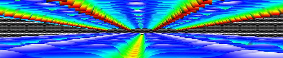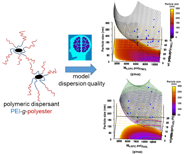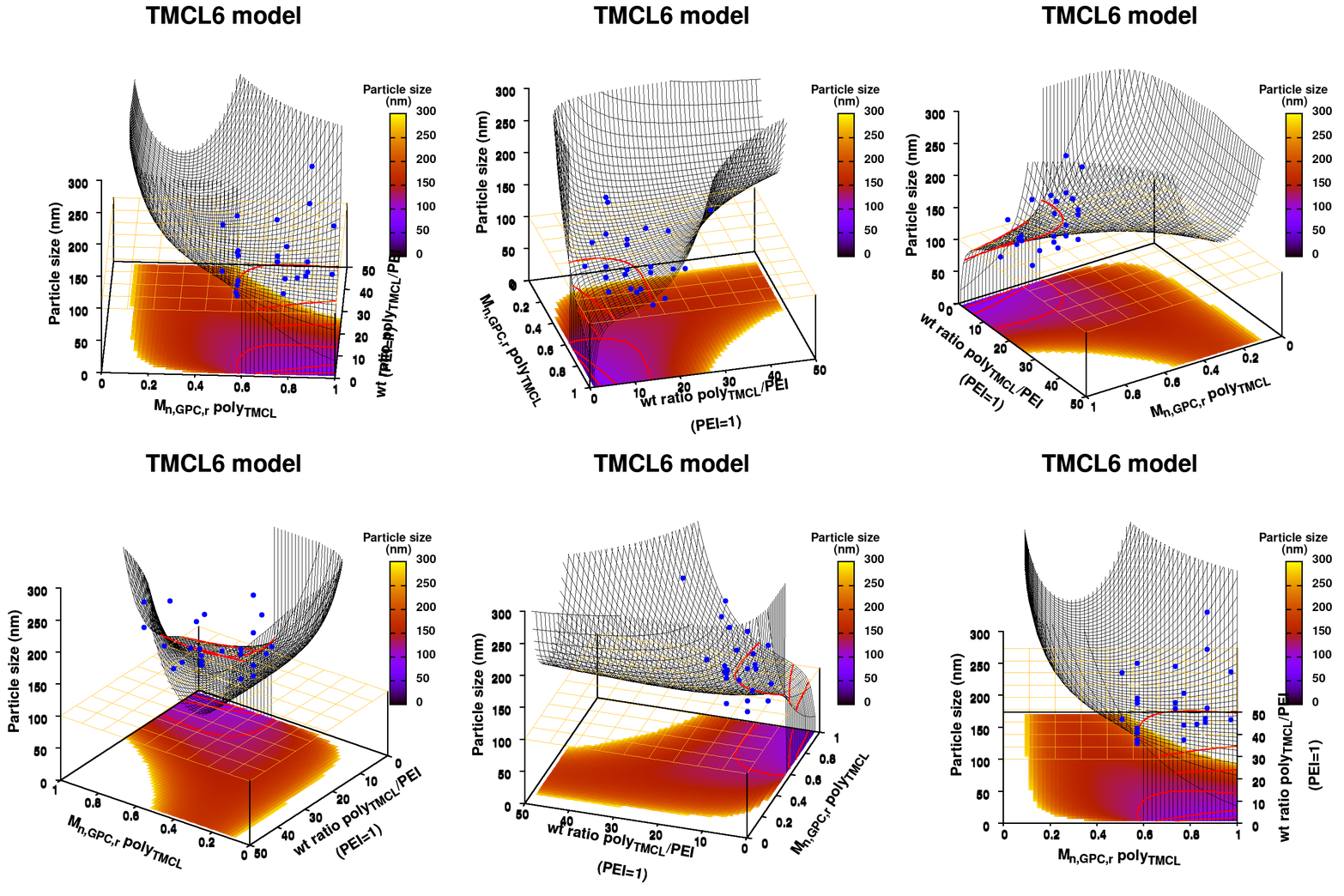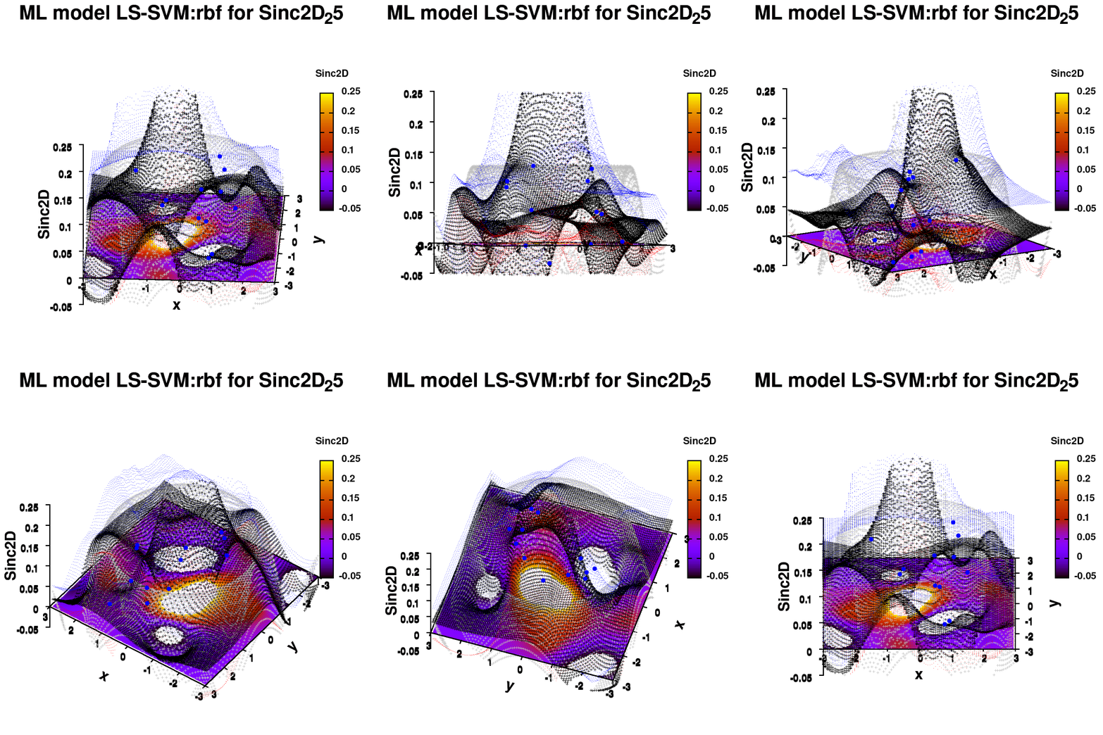
One of the most important aspects in machine-learning—in addition to the modeling itself—is undoubtedly visualization. This can be of either the data set itself or the resulting model. When dealing with small or sparse data sets and a limited number of features, visualization can be extremely helpful to get a feel for your model and data. In this tutorial, we show how you can use gnuplot to generate interesting animations of your data, such as the example above.
What do you need?
- Install Gnuplot version 5.2.8 (or higher) for your OS (under windows you can also install it under your Cygwin installation)
- A data set as a simple multi-column text-file data.dat .
- A similar text-file, model.dat, with your model calculated on a grid .
1. Starting simple: a static image
The main difference between an animation and a static image is the fact the former is just a series of such static images shown one after the other.
1.a. Basic image
Gnuplot allows both interactive and scripted command-line usage. The commands used in interactive mode can simply be placed in a text-file (e.g., myplot.gpl) and run using the command:
> gnuplot myplot.gpl
Comments can be added in such a file by preceding them with a single “#“. In the examples below, I’m using “###” as a personal choice. It shows clearly the location of the comments, and also gives me an easy way to distinguish with script lines I commented out for testing purposes, in which case I use a single #. In the following I also indicate gnuplot commands in red, while options are indicated in turquise. Let u start by plotting the data set in a simple png:
### Set the output to a png file
set termopt enhanced
set terminal pngcairo size 300,300 font "Helvetica-Bold,6"
### The file to write to
set output 'modelplot_v1.png'
### The Title label
set title 'ML model tutor' font "Helvetica-Bold,10"

splot "data.dat" u 1:2:3
Model v1
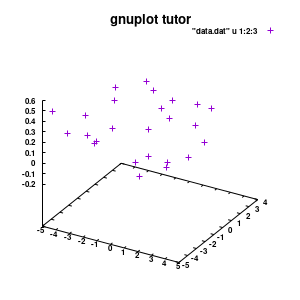
With this we set the output to be a png image of 300×300 pixels. (Note: pngcairo also provides png-functionality using the cairo-library. For more complex plotting, it gives much nicer images.) The default font for text is set to “Helvetical-Bold” with a font-size of 6pt. The enhanced option further allows us to use LaTeX type strings, for example indicating subscripts as A_n to print An. The resulting image is stored as ‘modelplot_v1.png‘.
The last two commands are used to create the actual plot. With set title a title can be added to the graph. The default font is replaced in this case by a slightly larger version of 10pt. The splot command allows you to plot 3D surfaces using the same basic information as the gnuplot plot command for 2D plots. In this case, I used the first 3 columns of the data.dat file to plot 3D data, with the x:y:z giving the respective column numbers. The result is shown on the right.
NOTE: An important point to consider is the fact that the font size is absolute. So if you decide later-on to change your image size to say 500×500 pixels, your text labels may look rather small, and you will have to tweak the font-size to compensate of this behavior. Therefore, it is important to make sure you start with the right image size straight away. The 300×300 pixels used in this tutorial are too small for any scientific quality image, it was chosen to be a suitable image size to incorporate in this blog.
1.b. Pimp the axis
With the basics for the graph set up, we can start setting up the graph to our liking.
###settings for the boxplot
set xlabel "M_{n polyX} (g/mol)" offset 0,-1,0 font "Helvetica-Bold, 8" rotate parallel
set xrange[1000:10000] noreverse writeback
set xtics 2000,2000,10000 out scale 1.0 nomirror offset 0,-0.5,0

set ylabel "Graft (%)" offset 2,0,0 font "Helvetica-Bold, 8" rotate parallel
set yrange[0:30] noreverse writeback
set ytics 0,10,30 out scale 1.0 nomirror offset 0,-0.5,0

set zlabel "Particle size (nm)" offset 1,1,0 font "Helvetica-Bold, 8" rotate parallel
set zrange[0:300] noreverse writeback
set ztics 0,50,300 out scale 1.0 nomirror offset 0,-0.5,0

set xyplane at 0
set border lw 3
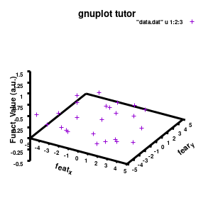
Model v2
The label of each of the three axes can be modified individually using set {x/y/z}label followed by the same options available to any other string (such as the graph title earlier). Here you can see how the enhanced mode allows the use of a subscript using standard LaTeX formatting. The offset makes sure the axis-label does not overlap with the tick-labels. Gnuplot also allows you to define the range to be plotted using set {x/y/z}range[min:max], while set {x/y/z}tics gives you access to the specifics of the individual tics. The latter can be very useful to manually add specific tics, or, as in the current case, manually set the splitting between the different tics. The out option places the tic-marks at the outside of the graph, and their size is set by the scale option.
The command set xyplane can be used to set the intercept of the xy-plane and the z-axis, and set border gives access to the axis-line properties. Here I have set the line-width (lw) to 3.
1.c. Add the (machine-learning) model
Now that the basics properties of the 3D graph are alright*, let us add the model to the plot. This can easily be done by just adding additional input for the splot command.
splot \
     "data.dat" using 1:2:3 with points pointtype 7 pointsize 1 linecolor rgb "brown4" notitle, \
     "model.dat" u 1:2:3 w line lc rgb "sea-green" notitle
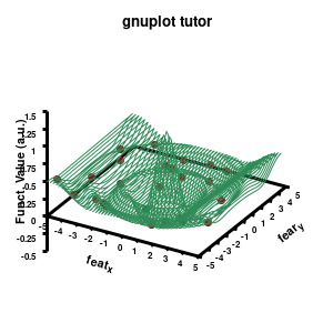
Model v3
The “\” can be used to split the command to multiple lines. In this case, each curve/surface/data set is set on a separate line. Since the command for a single plot can become very long, gnuplot also has a shorthand for most common keywords/options it uses. For the data the extended keywords are shown, and the shorthand is used for the model. The length of the command becomes significantly shorter, but at the same time harder to read. (Note that both shorthand as longhand keywords can be mixed in a single command.)
The data set is now being shown as points, using the 7th pointtype (which are discs). The size of these symbols is set to 1 and the linecolor is a predefined color used by gnuplot. Finally, the notitle option removes the legend entry of this curve. The model data is presented as a line-surface. The end result is shown on the right.
1.d. A better surface-plot: Multi-plot
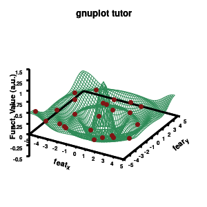
Model v4
As you can see in the previous version of the plot, the model data is plotted as a surface, but this is not a very nice surface. This is because gnuplot just connected the sequential points in the file as a single very long and very complex curve. If you would rotate this plot, it would become clear, several things are very wrong. Luckily there is a very simple solution. Gnuplot has the ability to transform a point-cloud into a surface. This is done by setting a 3D grid using set dgrid3d X,Y. This creates a 3D surface for which the nodes are interpolated between the points of your point-cloud. When you set this option, it is applied on all data curves you plot (i.e., including the set of data-points, which we would like to avoid.). Using the multiplot option of gnuplot the two curves can be drawn separately, using different settings. In the script the splot command is replaced by:
### switch to a multiplot
set multiplot
set dgrid3d 50, 50
splot \
     "model.dat" u 1:2:3 w line lc rgb "sea-green" notitle

unset dgrid3d
splot \
     "data.dat" using 1:2:3 with points pointtype 7 pointsize 1 linecolor rgb "brown4" notitle

unset multiplot
By setting the multiplot environment, we can unset dgrid3d before drawing the second data set. At the end of script we also unset multiplot to switch of the multiplot environment. At this point it become interesting to see the impact of the terminal pngcairo over png.
1.e. Surface coloring
Drawing a surface is nice, but you can also give it some color. Either by using the z-value as a color scale, or by using another metric/feature to color the surface.
###settings for the color scale
set colorbox vertical
set cblabel "Colormap\n (RGB)" font "Helvetica-Bold, 8" offset -6.75,8 rotate by 0
set pm3d at s explicit

splot \
      "model.dat" u 1:2:3 w pm3d notitle
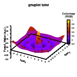
Model v5
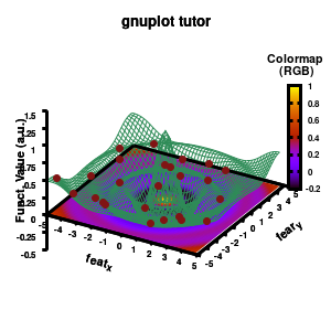
Surface coloring is switched on via the command set pm3d which is set at the surface, and is used in splot at the with option. In addition to surface coloring also a color scale is added, with the label formatted using the same options as for other labels. To get the label above the color scale it needs to be shifted using the offset and the rotate option.
The result is rather fancy, but for practical purposes, the surface may actually block the view of the data points. This can be avoided by projecting the color on the xy-plane and retaining a grid representation of the surface. This is done by setting pm3d at the bottom.
Model v6
In addition, we also need to plot the model surface twice, once to generate the color map and once to generate the model surface as a grid-image.
set pm3d at b explicit

splot \
    "model.dat" u 1:2:3 w pm3d notitle,\
    "model.dat" u 1:2:3 w line lc rgb "sea-green" notitle
2. Creating an animation
With gnuplot it is quite easy to generate stunning 3D animated gif images. Some nice examples can be found all over the web, such as this animated Bessel function, my own (very old) molecular d-and f-orbitals, or this collection. Once you finish creating a script to generate a single image, creating an animation requires only some minor modifications. First of all we need to select the correct terminal (i.e., gif instead of png)
set terminal gif transparent animate nooptimize delay 10 size 300,300 font "Helvetica-Bold,10"
set output 'modelplot_v7.gif'
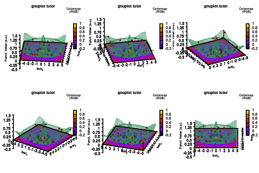
This generates a transparent animated gif with a delay of 10 ms between frames, and stores it in a gif image. In addition, a change in time/image frame needs to be implemented. This can easily be done by a simple for loop, which is wrapped around the plotting section.
n=60
do for [i=1:n]{
    set view 60, i*360/n

    ### do the multiplot plotting section
    set multiplot
    ...all the other plotting stuff of before
    unset multiplot
}
set output
model v7: animated
In the example, the 3D graph is rotated. This is done by changing the view via the set view command which takes two angles in degrees. As you can see from “i*360/n“, gnuplot also accepts simple mathematical equations.
Once the loop is finished we need to close our gif animation. This is done via (a side-effect of) the command set output. The set output {filename} command sets the output to a file with name filename, or if a filename is omitted to the standard output. As a side-effect it closes the current output file, c.q. our animated gif.
An alternative method for creating an animation would be creating a series of images (in the image-format of your choice, e.g. pngcairo and then create an apng) and combining them yourself or via additional scripting into an animated image format using additional software, such as is done here.
3. Animated surfaces and coloring
The example above is rather trivial in regard to animations. The ability to perform math inside a gnuplot script provides you the ability to make things a lot more interesting. In the following, we are going to construct a small imaginary solar system, to present some of the things which are possible.
The basic script for the solar system above can be downloaded here.
set termopt enhanced
set terminal gif animate nooptimize delay 10 size 300,300 font "Helvetica,10"
set output 'Solarplot_v1.gif'
set title 'Magic Solar System' font "Helvetica-Bold,10"

maxl=10
set xrange[-maxl:maxl] noreverse writeback
set yrange[-maxl:maxl] noreverse writeback
set zrange[-maxl:maxl] noreverse writeback
set xyplane at 0
set border lw 1.5

###Use parametric coordinated for plotting spheres
set parametric # enable parametric mode with angles (u,v)
set urange [0:2*pi]
set vrange [-pi/2.0:pi/2.0]
set isosample 360,180
fx(u,v)=cos(u)*cos(v)
fy(u,v)=sin(u)*cos(v)
fz(v)=sin(v)

### Surface coloring
set colorbox vertical
set cblabel "Planet\n colors" font "Helvetia, 8" offset -4.75,5 rotate by 0
set pm3d depthorder base nohidden3d
unset hidden3d

### The animated drawing
n = 60
do for [i=1:n]{
    # The star
    x=0.0
    y=0.0
    z=0.0
    r=3.0

    # The first planet
    x1=5.0*sin(i*2*pi/n)
    y1=5.0*cos(i*2*pi/n)
    z1=0.0
    r1=0.50
    color1(u,v)=0.5

    # The second planet
    x2=6.5*sin(i*2*pi/n)
    y2=7.0*cos(i*2*pi/n)
    z2=1.0*cos(i*2*pi/n)
    r2=1.0
    color2(u,v)=sin(v)*2*pi

    splot \
         "++" using (x+r*fx(u,v)):(y+r*fy(u,v)):(z+r*fz(v)):(6.5) w pm3d notitle,\
         "++" using (x1+r1*fx(u,v)):(y1+r1*fy(u,v)):(z1+r1*fz(v)):(color1(u,v)) w pm3d notitle,\
         "++" using (x2+r2*fx(u,v)):(y2+r2*fy(u,v)):(z2+r2*fz(v)):(color2(u,v)) w pm3d notitle
}
set output
Most of the commands and options have already been covered above. To draw our spherical planets, we introduce a set of parametric coordinates (u,v) via the command set parametric. Next we set their ranges, just as you would do for the x,y, and z coordinates via set {u|v}range. The command set isosample is used to define the grid over the parametric space. With this setup, you can now define any parametric surface you want. In our case, we want to have a sphere. For this we define three transformation functions. With u and v representing the θ and φ angles of a sphere, the transformation to Cartesian coordinates is given by the functions fx(u,v),fy(u,v), and fz(v).
In the main loop of the gif we define the center position (x,y,z) and the radius (r) of our planets and star, with the latter nicely fixed at the origin, and our planets having an orbit around it. To have a nice periodic gif, you should make sure that any periodic behavior ends up where it started, hence the 2pi factor in the sines and cosines. Everything is drawn with a single splot command where we use a pseudo 4-column input style:
(x-coord):(y-coord):(z-coord):(color-coord)
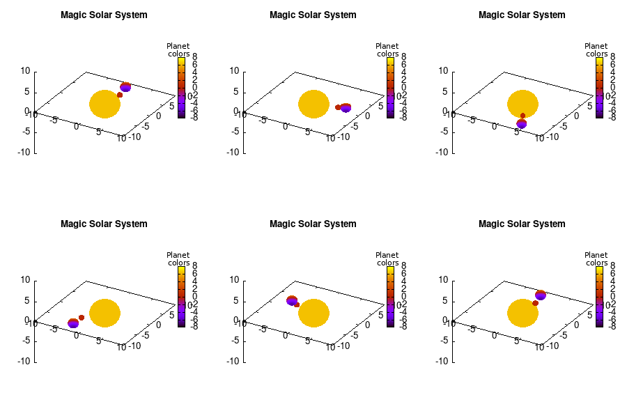
Note that the brackets ‘(‘ & ‘)‘ are important to include as gnuplot will throw errors otherwise. The selected color, can be either a real value in the color scale or a function. The resulting solar system is shown below on the left.
 Solar v1, no depth |
 Solar v1, depth |
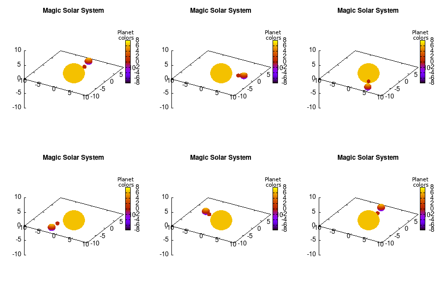
Not that bad for a first attempt. There is however a small snag: the 3D effect is somehow off when the planets move behind the star. This is due to the depth-buffering. The newest versions of gnuplot (≥5.2.8) provide the option depthorder for the set pm3d command. Using the value base for the depthorder option results in the depthorder to be decided based on the z-projected position of the object. This is sufficient to fix our little solar system, as you can see on the right.
3.a. Some cleanup work: removing the box and complex coloring
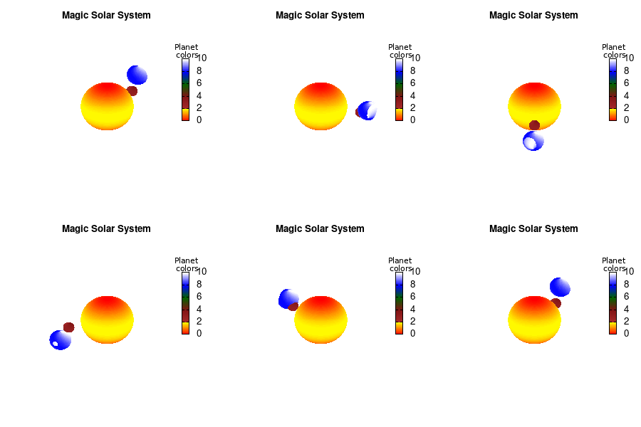
As we are creating an imaginary (magical) solar system, we should maybe get rid of the x-,y-, and z-axis. This is done via the commands unset border to get rid of the axis-bars and unset {x|y|z}tics to remove the tic-marks and-labels.
unset border
unset xtics
unset ytics
unset ztics
set palette defined (0 "red", 1 "yellow",1 "brown", 2 "brown4",3 "dark-green", 4 "blue", 5 "white")
set cbrange[0:10]
#unset cbtics
Solar v2
And although the color palette provided is nice, if we want different color schemes on each of the planets, we quickly run into a small problem: you can only have 1 color palette per splot. In case of a static image, you might be able to get around this problem by using a multiplot (as before) and have overlapping splots with each their own palette. But…in that case you will also be responsible for getting the 3D order of your objects correct yourself. And although this may be doable for a single frame, in case of an animated 3D solar system this will be a hassle nearly impossible to overcome**. For this you need to tackle the problem in a different way: create your own color palette consisting of sub-palettes. This can be done via the command set palette defined. The pairs give the color at the endpoints of gradient ranges, with the overall range (here 0-5) representing the entire color scale. The intermediate points are placed equidistant, so for a color range from 0:10 the red-to-yellow gradient is linked to color values in the range 0:2, while the blue-to-white gradient is linked to the color values in the range 8:10. Applying this to our solar system we can give nice individual color palettes to each of the objects. I changed the size and position of the three objects a bit, and as you can see, the outer planet moves outside of the x/y/z-ranges. Now that we know how to add different color palettes to each of our planets, we can also remove the color-bar on the right using the command unset colorbox, remove the tics via unset cbtics, and remove the label via unset cblabel.
3.b. time-dependent colors
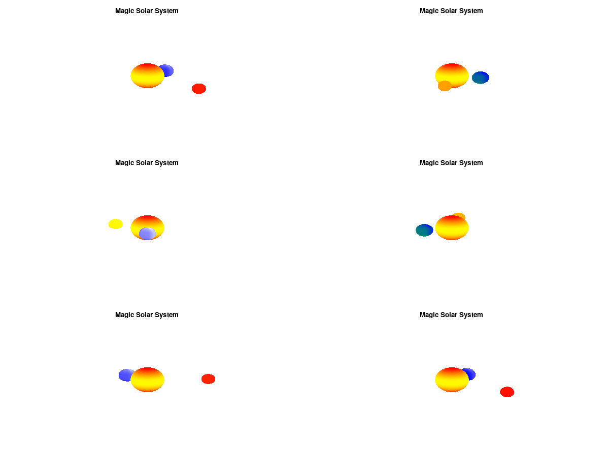
We have motion of objects and different color palettes, what about changing the colors during the animation? As we saw earlier, the color component can be defined as a function, which means we can make this time-dependent as well. Let’s imagine that our outer planet is traveling on a rather elliptic orbit, making it heat up when it approaches our star.
# The first planet
    color1(u,v)=0.5*(cos(u)**5+sin(v)**3)+sin(i*6*pi/n) +8.0

# The second planet
    x2=8+15*sin((i+20)*2*pi/n)
    y2=6.0*cos((i+20)*2*pi/n)
    z2=3.0*cos((i+20)*2*pi/n)
    color2(u,v)=0.99*sin((i+20)*2*pi/n+pi)+1
By making the color dependent on the frame number, the (uniform) coloring of our second planet will now cycle through the red-yellow gradient. The first planet experiences a variation at 3x the speed but have a non-uniform surface coloring.
Solar v3
3.c. time-dependent colors and shapes
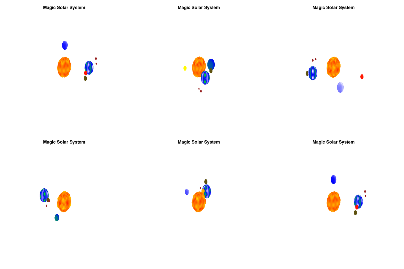
Once you have time dependent coloring, and time dependent motion, you can also have time dependent shapes and combine all three. This is all possible within the same basic framework set up above. For example, we can make our star a bit more active, letting it bulge and swirl. Adding another planet and some moons the magic solar system below is created by this gnuplot script.
Solar v4
4. Conclusion
Gnuplot provides a versatile tool for creating animated gifs of your machine learning data and models, or anything else you could imagine. It has an extensive number of options which allow you to tweak each single property of your graph. The ability to perform simple arithmetic within a gnuplot-script further increases the potential.
Ignore the rather crummy quality of the embedded images. This is an artifact of only having a 300×300 pixel image, the animation at the top of the page has an 1000×1000 pixel resolution and shows a much better quality.
Of course with enough persistence you may find a way to get it done…but there are less sadomasochistic ways of doing this 😉